How to Design the Best Logo

The first logo to be trademarked was the Bass red triangle in 1876.
It's a warm sunny day and you've been driving for hours. A driver in a jaguar overtakes you -.you know it's a jaguar because of that iconic hood ornament. You're hungry and you're looking around for somewhere to eat when, peering out from the distance, you notice two great yellow arches stretched out like an 'M'. 'M' for 'McDonald's'. You need no persuading - you park the car and go in. Written in white on red, the Spenserian Script reads 'Coca Cola' - now you're thirsty. Shall I go on?
We all know the importance of a good logo. Not only does it tell us what we're buying but how we should feel about it. Put simply, it's the keystone to a company's brand and it doesn't take a genius to design a good one. Here are some things to think about...
Keep it Simple
If you want your customers to remember your logo, it's better to use basic shapes and limit the number of colors. You may only have a second to catch someone's attention and too many details may not communicate your message fast enough.
Where is it Going?
When designing a logo, it's important to think about what you're going to use it for. A logo with too much detail may get lost once it's shrunk down for business cards. If you're putting it on a sign, your logo may need bold colors or features so it can be easily recognized from a distance.
Who is it for?
Consider your target market. How old are they? What kind of style would they appreciate? An office space aimed at entrepreneurs, for example, may use a modern techy font in lower case to appear young and creative.
Make it Mean Something
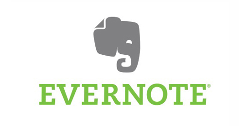
Although your logo can be simple and abstract, it's good to have little motif running through it. A great example of this is Evernote. Elephants are associated with a strong memory - perfect for an app which specializes in saving and sharing notes.
At SpaceSquared we design beautiful responsive websites for small businesses and entrepreneurs.